The app lacked engagement and failed to highlight the app’s core value early in the user journey.
The goal was to personalize the experience based on user goals and to redesign the onboarding to create a more professional first impression.
Ultimately, we wanted to increase user activation and conversions.
ROLE
Product Designer
TEAM
PM, UA, Software Engineer
TOOLS
Figma, Miro, MixPanel
TIMELINE
Oct 2024 – Jan 2025
What It Took to Lift Trial Starts by 16.5%
Redesigning an onboarding experience isn’t just about better visuals, it’s about reducing friction and guiding users toward their ‘Aha! Moment’ before they drop off.
Market analysis: onboarding flows
I analysed onboarding flows from dozens of apps. The goal was to identify common patterns, best practices, and potential pitfalls that could inform my decisions.
Integrate personalisation early in the process tend to achieve higher engagement.
Visual storytelling (images + concise text) reduces the cognitive load and keeps users moving.
Social proof (reviews, testimonials) increases perceived value.
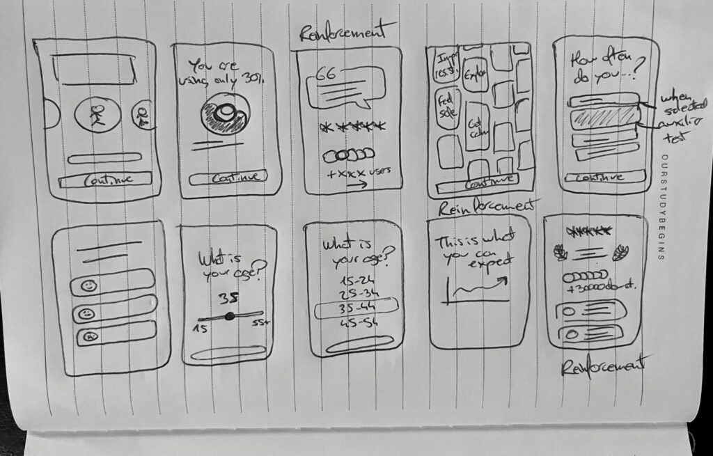
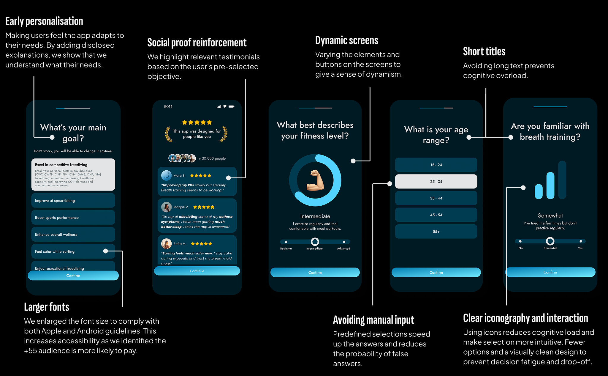
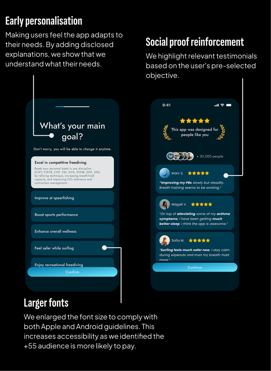
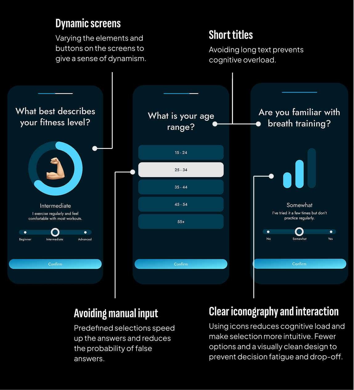
I created some low definition wireframes. The proposal includes an improved goal-based question, testimonial reinforcement screens, and more dynamic question formats to encourage completion.
analyzed behavioral data
I identified that users had diverse goals and interacted with the app in different ways. Based on these insights, I created flowcharts to map out each user journey during onboarding
ONBOARDING: best practices APPLIED
Progressive Disclosure
The onboarding reveals relevant details progressively.
Personalization
Goal-setting screen to personalise the experience early on.
Social Proof
User testimonials and ratings reassures credibility and impact.
Achievement Framing
Increase user motivation by showing benefits in performance.
Dynamic Selection UI
Onboarding redesigned into a more interactive and visual.
Accessibility
The UI maintains high readability and usability across devices.
BEFORE redesign
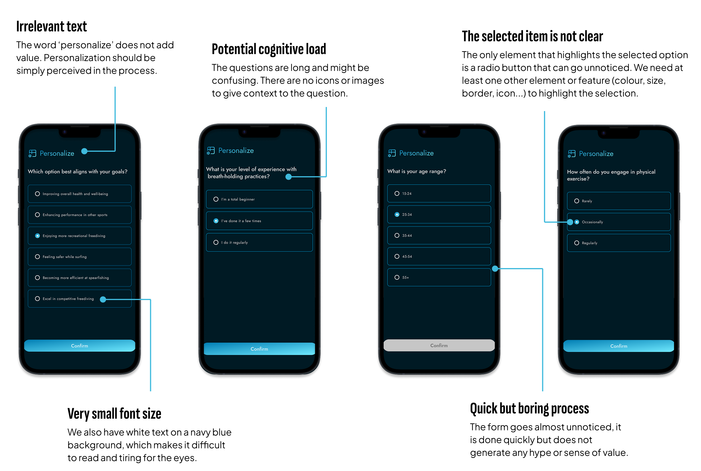
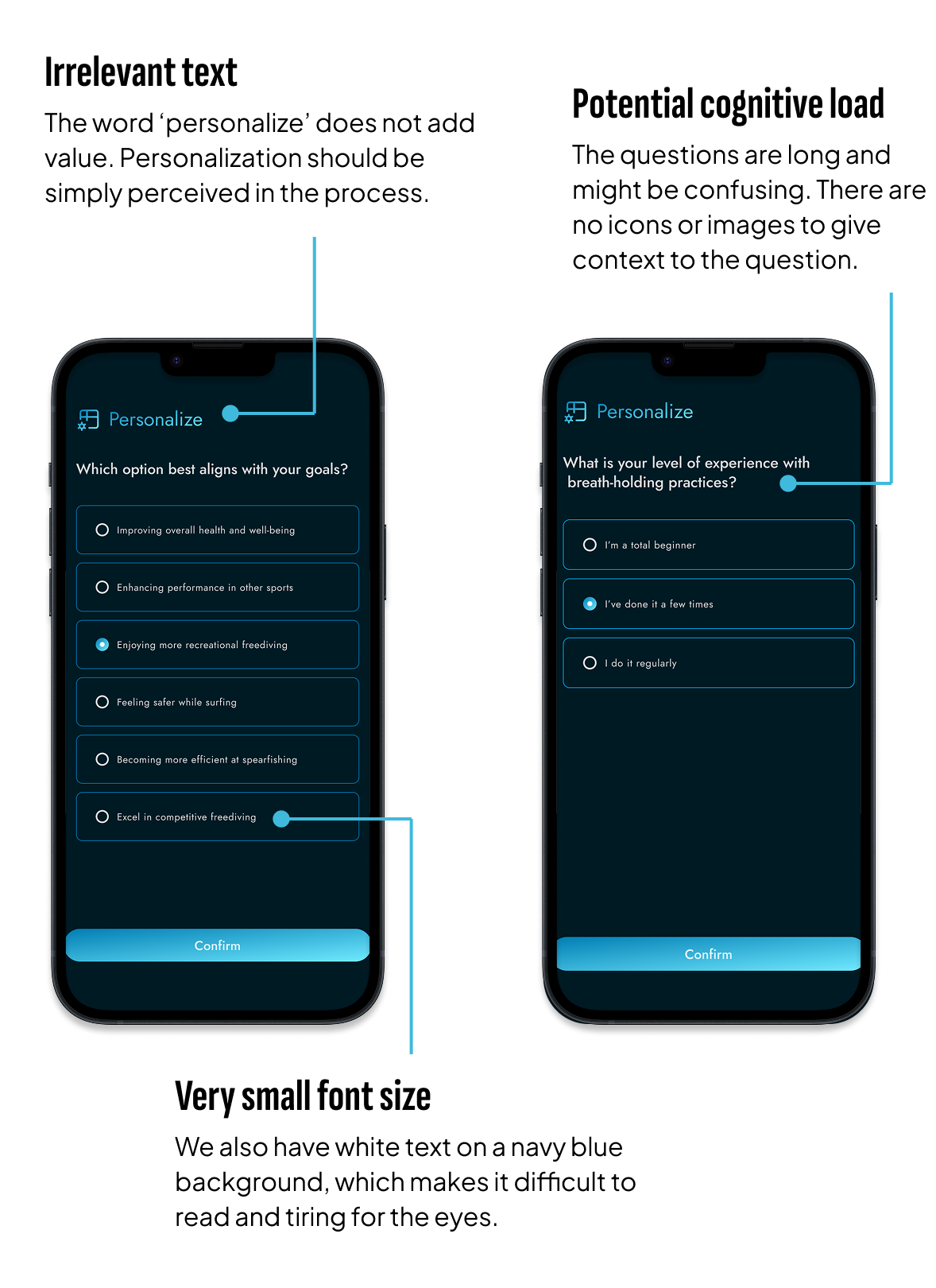
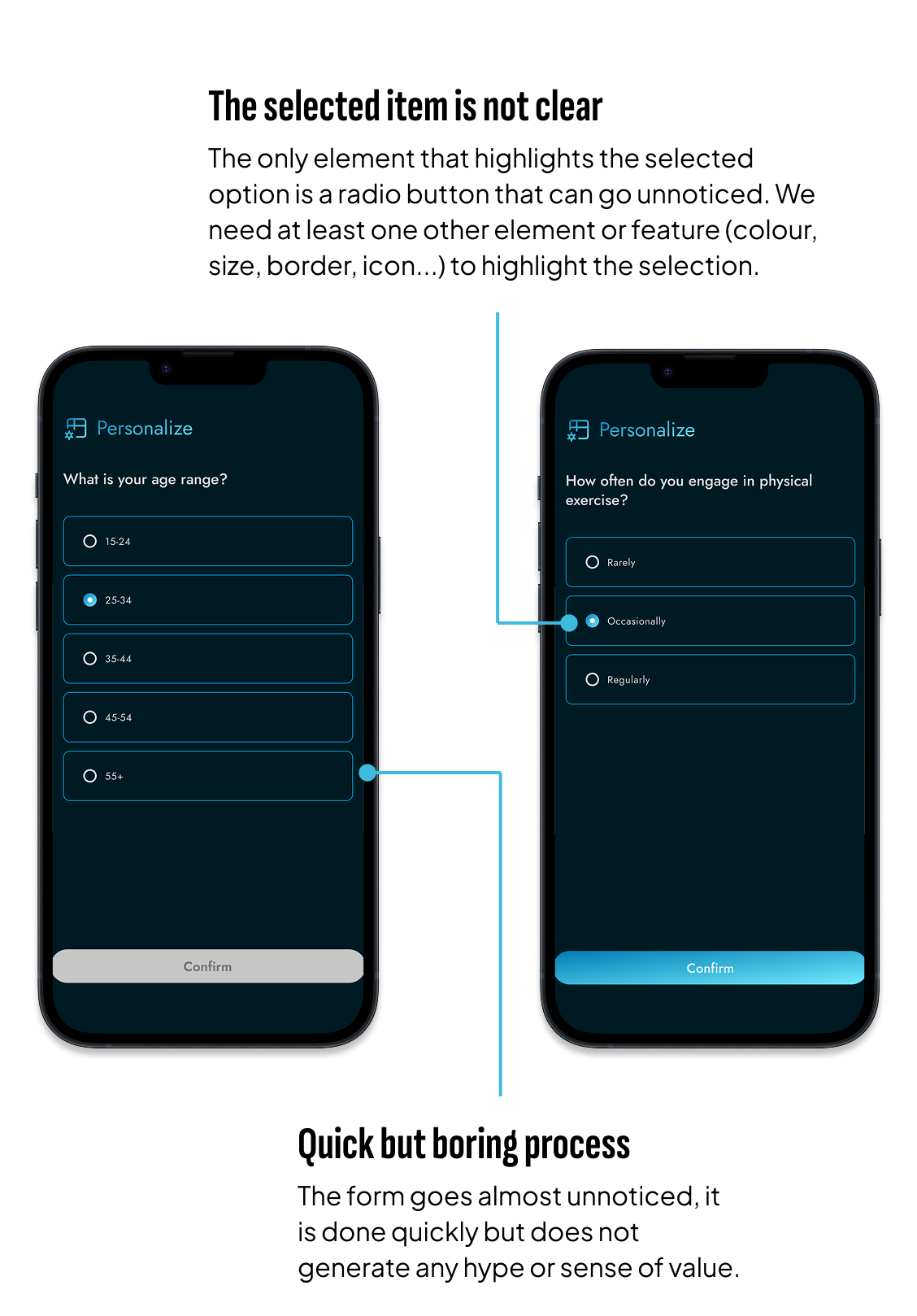
AFTER redesign
Personalization matters
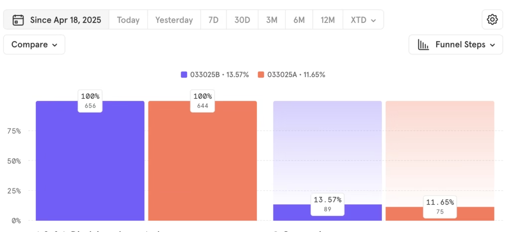
A/B testing showed 16.5% increase in free to trial conversion with the new onboarding screens, confirming that a more profesional look & feel also increase value perception.
Let's Chat
Do you have a product idea, want to discuss a project, or need a designer? Drop me an email at hi@designbysofi.com