Redesigned of a Surf School website to reduce cognitive overload, simplify booking paths, and make it mobile-friendly. Resulted in +727% mobile engagement and +361% desktop interaction.
the challenge: Simplifying the Path from Browsing to Booking
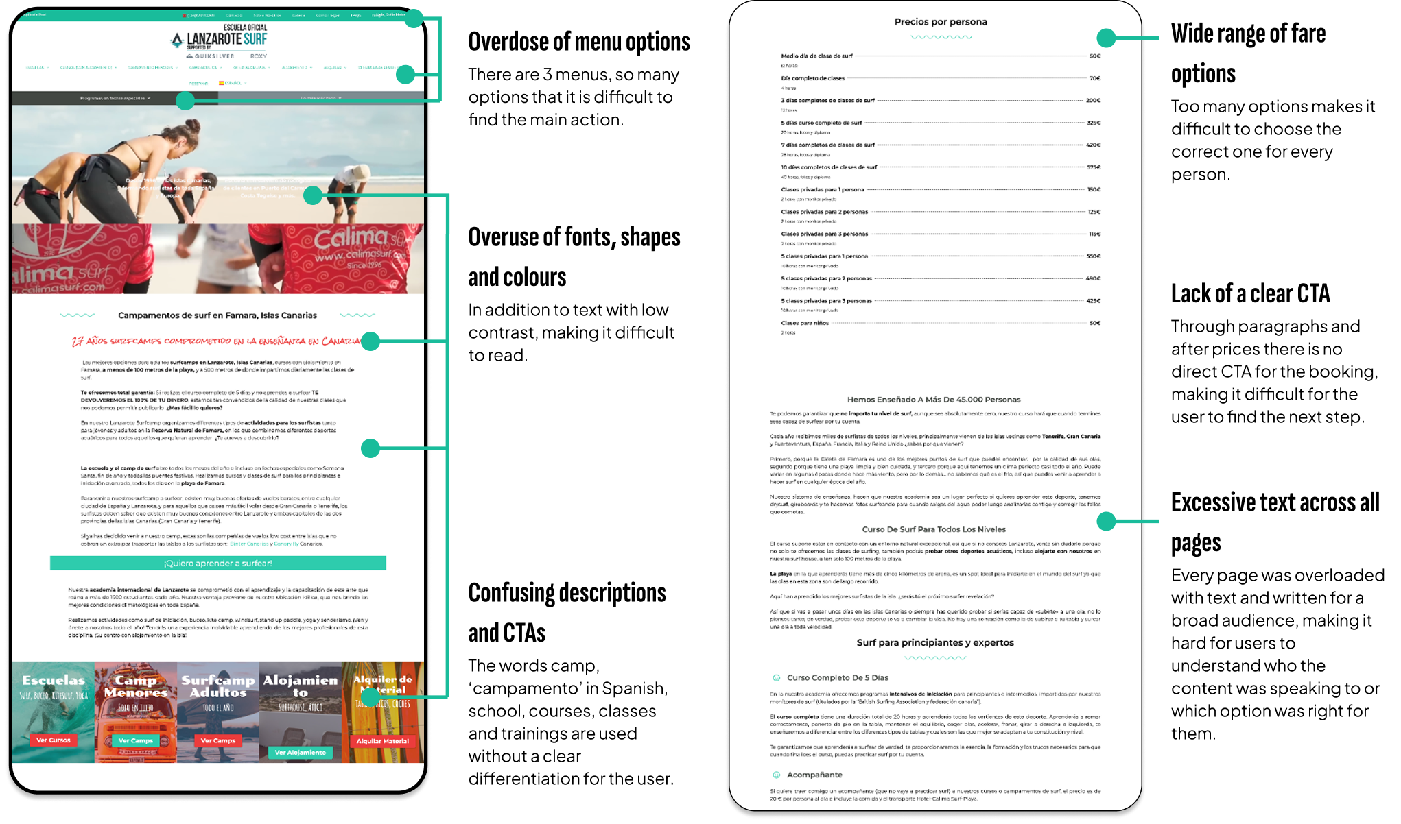
Lanzarote Surf, one of the most recognized surf schools in the Canary Islands, struggled with a cluttered, overwhelming website.
Users faced difficulties regarding:
Navigating the site.
Understanding available courses.
Completing bookings.
The website contained excessive text, inconsistent branding, and lacked a streamlined user flow.
ROLE
Web Designer & Web Developer
TEAM
PM, UA Manager, Software Engineer
TOOLS
Figma, Miro, Google Analytics, Hotjar, WordPress
TIMELINE
Oct 2024 – Jan 2025
JOB TO BE DONE
Simplify content structure to make course options clearer and easier to navigate.
Enhance branding consistency to improve credibility and user trust.
Optimize for conversions by making CTAs more prominent and reducing friction.
Improve mobile experience, given that most visitors accessed via mobile.
Maintain SEO rankings by keeping original URLs intact.
USER INTERVIEWS: UNDERSTANDING THE PROBLEM and designing responses
Despite the amount of information available on the original website, users were still struggling to find clarity.
I conducted user interviews to uncover the causes for potential customers to drop off before reaching the booking step.
Users struggled with too many options, so I simplified offerings to highlight the most popular plans.
Information overload as a way to boost SEO interrupted the user experience. I moved that information to the footer via FAQs, while still optimizing for SEO.
Too much text made hard looking for the right information. I used dropdowns, carousels and iconography to facilitate reading.
Usersdidn’t know their surf level. We added a comparison table to help them self-assess before booking.
CTAs were not visible enough, we made them bold, consistent, and action-driven.
Solo travelers hesitated to book, so we Adjusted messaging to encourage individual sign-ups.
quantitative research: going deeper into the problem
To understand how the original website was performing and where users were engaging (or dropping off), I conducted a multi-source research process combining:
Google Analytics (GA4): to track traffic sources, device behavior, top-performing pages, and funnel drop-offs.
Hotjar: to analyze heatmaps and scroll depth, identifying where users lost interest or missed key actions.
Semrush: to audit search visibility, keyword positioning, and competitor presence across surf-related queries.
more findings (cz nothing like qualitative data)
Users engaged but didn’t convert.
Mobile dominated traffic, yet underperformed in conversion. Only 8% reached product pages, compared to 13% on desktop.
Most bookings came from solo travelers choosing single classes.
50% of all bookings were for 1 person, and for a half-day single session.
A few pages concentrated the majority of traffic. I reorganized the menu based on real entry points.
Heatmaps showed users didn’t scroll far enough to reach booking CTAs. I placed a clear CTA at the top of each page, reduced page length, and minimized the number of clicks needed to make a decision.
BEFORE
AFTER
MOBILE FIRST FOR GROWTH
Post-launch impact: Optimized for mobile-first growth.
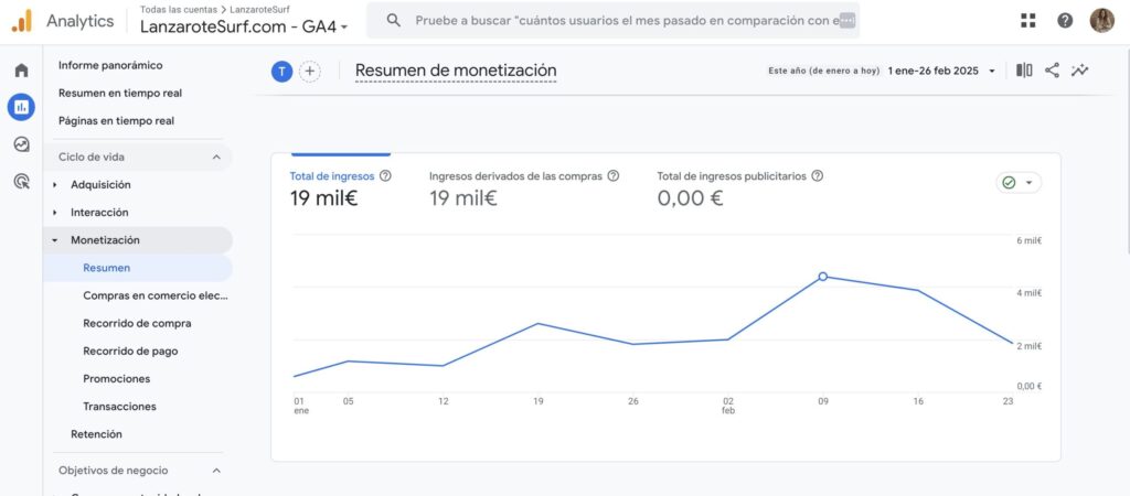
€19K in revenue in the first 8 weeks — setting a solid foundation for 2025 growth
Mobile sessions and engagement time skyrocketed, showing improved UX.
Avg. interaction time: +727% (from 6s → 55s)
% of sessions with interaction: +95% (from 24% → 47%)
Bounce rate dropped by 35%, thanks to improved navigation
Customer support inquiries reduced, as FAQs covered common concerns
what's next? keep tracking
The client has been recommended to continue to monitor the website in Google Analytics, with heat maps and user interviews. In addition, the number of customers accessing through direct CTAs to the booking is being measured.
With this information, advertising actions can be proposed in Google and Meta Ads to attract specific and interest-targeted customers to each of the pages.
It is also proposed to encourage the use and application of a Live Chat bot to resolve doubts within the platform and thus reduce the number of emails and WhatsApp messages received by the customer.
The design must remain alive. This design has been presented based on the results of the previous study, but I am convinced that it can be further optimised and A/B tests can be carried out to make new decisions and continue implementing improvements.
Let's Chat
Do you have a product idea, want to discuss a project, or need a designer? Drop me an email at hi@designbysofi.com


