Onboarding and paywall optimization for a travel app
Redesigning Travel Diaries’ onboarding and paywall to turn early drop-offs into trial and trial to paid conversions.
ROLE
Product Designer
TEAM
PM, UA, Software Engineer
TOOLS
Figma, SensorTower
TIMELINE
Aug 2025 – Sept 2025
CHALLENGE: Early Paywall Blocked Conversions
Travel Diaries lets users record and share their trips through online journals and printed books.
It started as a free app that earned money from book sales, but in 2022 it added a paid membership to create steady income.
The model brought stability, but only about 10% of users converted, and book orders dropped as people were writing online but not printing.
Users had to subscribe before seeing any value, even to print a book. The paywall appeared before users could understand what they’d get.
goal: reducing friction
The redesign focused on reducing friction and aligning monetization with user intent.
Instead of locking the app behind a paywall, we redesigned the flow to guide users through a clear, personalized, and trust-building experience.
aha! moment during onboarding
We want users to answer a few questions about their travel situation and goals. This allows the app to show the right plan (online journaling vs. printing) and collect valuable segmentation data for marketing while giving a sense of personalization.
Before the paywall, users experience the aha! moment by previewing journal covers to see the value of the app without paying yet.
Personalization makes users feel like they already started something worth keeping. It raises perceived value, increases willingness to pay, and motivates sign-ups to save their progress.
From Friction to Flow: The New Paywall Experience
We start with a trial. Users add payment details first, which increases commitment.
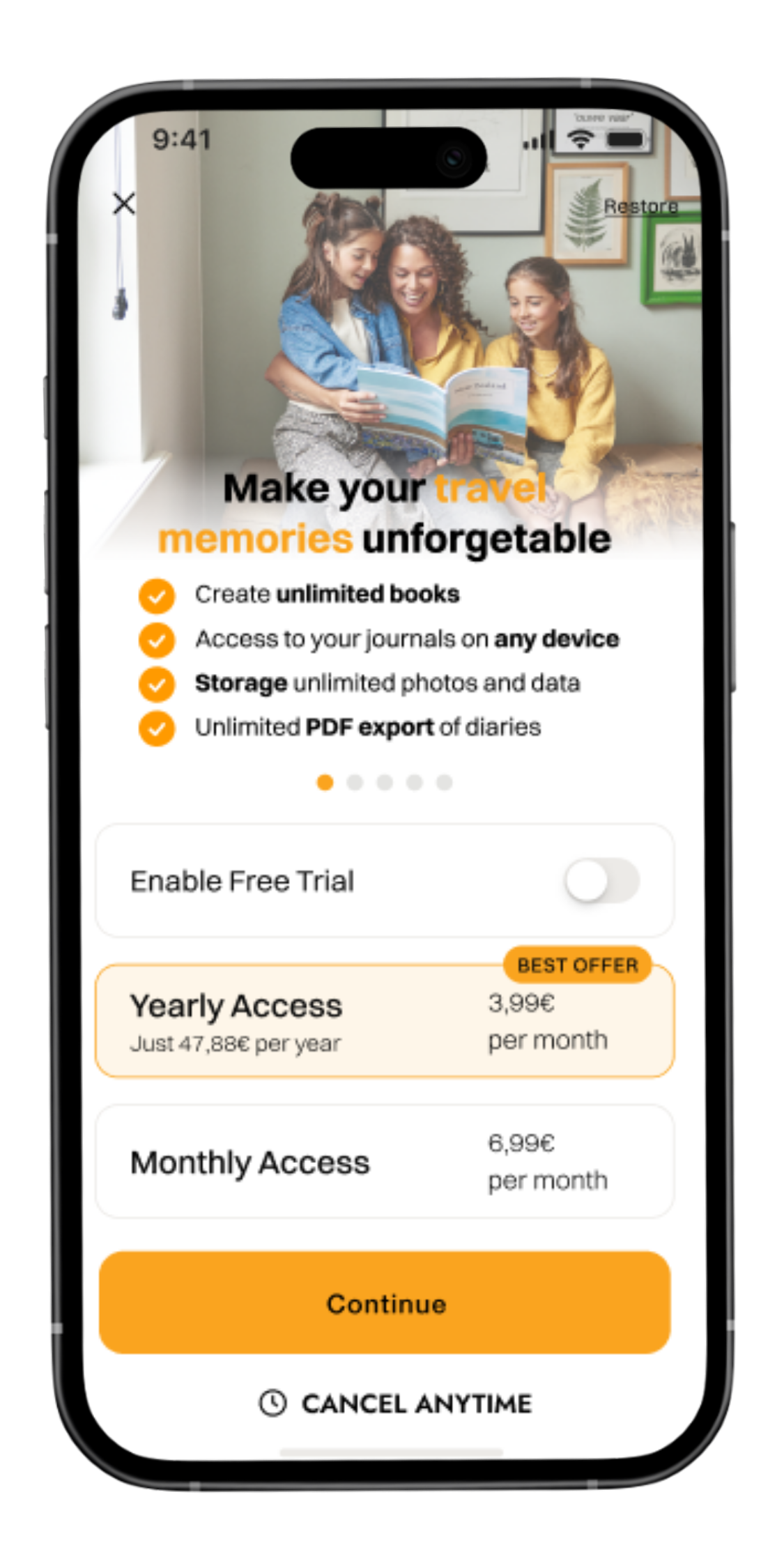
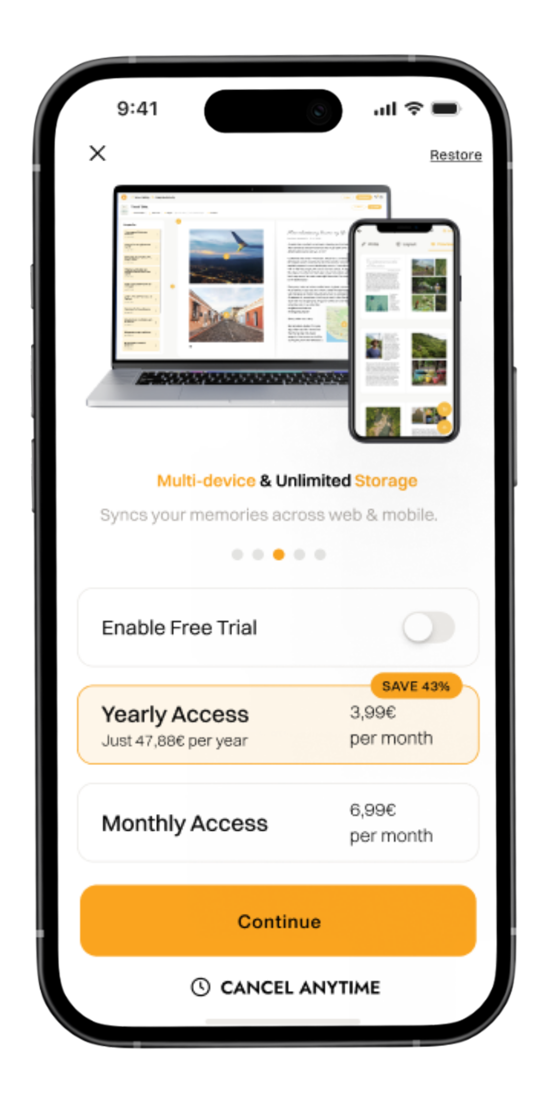
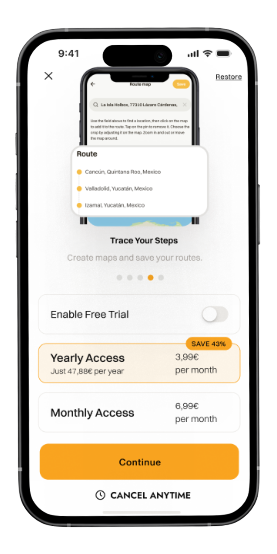
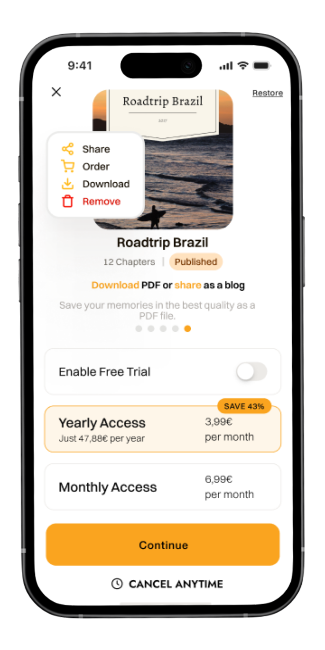
Reduced cognitive overload by offering fewer pricing plans and clearer benefits.
Hard paywall. An horizontal scrollable layout shows key features.
Signup at the end so users can experience the app’s value first.
talking to the user to improve conversion
This project showed me that good conversion design is not about adding more, but about removing barriers. By reordering steps and linking the payment model to user goals, we turned a blocking point into a smooth journey. It also showed how powerful personalization can be for growth. When users feel understood, they convert for the right reasons.
Let's Chat
Do you have a product idea, want to discuss a project, or need a designer? Drop me an email at hi@designbysofi.com